Tuesday, December 30, 2008
“Aging And The Brain” illo for U. of Miami
This illustration accompanies an article that discusses strategies for maintaining and extending cognitive longevity as one ages. Exercise, diet, and intellectual activities are important components in staying sharp. The art director, Scott Fricker, wanted an image that stressed these strategies. He specifically asked for distressed textures, a favorite technique of mine, but without appearing dark or ominous. Probably the most frequently asked question from art directors over the years has been, “ I really like your work, but can you make it less dark?” I felt I struck a pretty good balance here. Below are the two rough sketches presented.
CLIENT: UNIVERSITY OF MIAMI (FL)
ART DIRECTOR: SCOTT FRICKER
Tuesday, December 9, 2008
Work In Progess: “Seen The Glory” book cover
In this Civil War novel, by John S. Hough, Jr., two teenage brothers leave the relative comforts of their Martha's Vineyard home to join the Union Army, ultimately leading to their participation in the notoriously bloody Battle of Gettysburg. Meticulously researched, the book provides a riveting look at both military life and the societal conflicts that marked the period.
Below are the original sketches, and above are three versions of the finished artwork. This one is still pending approval. At one point, as the various props were arriving at our house, my wife said to me, “Please tell me you didn't buy that musket.” No, just rented.
CLIENT: SIMON AND SCHUSTER
ART DIRECTOR: MICHAEL ACCORDINO
Saturday, November 29, 2008
“Escape By Sea” Book Cover
Escape By Sea, a young adult historical novel by L.S. Lawrence, takes place during the Carthaginian-Roman wars. Sara, the fifteen year-old daughter of a wealthy Carthaginian senator, transforms herself by force of circumstance, from an over-protected child into a leader of men during a time of war. I had not done anything from this time period before, so it was fun doing the research to get the styling and scenery right. A bit of a challenge, too, since apparently there is practically no surviving art from the culture of ancient Carthage. In the end, I created the costume based on a synthesis of Roman and pre-Islamic Arabic dress. The model was photographed against a white backdrop, and the background created separately from images in my archives. Then the two images were composited in Photoshop.
CLIENT: HOLIDAY HOUSE
ART DIRECTOR: CLAIRE COUNIHAN
Tuesday, November 18, 2008
Oberlin Alumni Magazine Cover
Oberlin College has embraced environmental sustainability as a core aspect of what its students should learn. The cover story of this issue of the alumni magazine discussed the many initiatives now underway at the College, including innovations in waste water treatment, use of locally grown produce, energy use monitoring, a solar parking pavilion, and an exceptionally bike-friendly campus.
They wanted a cover image suggesting a variety of these initiatives, so that details could be pulled out for use as spot illustrations throughout the article. Below are the original rough sketches presented.
CLIENT: OBERLIN COLLEGE/KELEMAN DESIGN
ART DIRECTOR: BOB KELEMAN
Monday, November 17, 2008
“Crossing Stones” Book Cover
Though the conventional wisdom in cover design is to avoid having the visual literally duplicate the title, I felt I could not avoid it for this young adult novel told in verse form. Set in rural Michigan in the year 1918, Crossing Stones, by Helen Frost, follows the intertwined lives of two pairs of young adult siblings all struggling to find their paths in life. World War I, the flu pandemic, and the women’s Suffragette movement all figure prominently in the story. The over-riding tone of the book is heartfelt and bittersweet, and this is what I tried to convey in the artwork.
After the concept was nailed down and approved, my biggest challenge was finding the right setting to make the photographs for the montage. Though, as luck would have it, I am very familiar with rural Michigan. Unfortunately, I live now in southwest Florida, which bears little resemblance. For one thing, while there are plenty of creeks here (and no palm trees in Michigan), there are virtually no creeks here with stones. In the final image, I was able to use a creek I shot near my house, but the stones were added using a tabletop still life I made for the project. The model was shot separately in a park nearby, and the rest of the landscape was added with images from my archives.
CLIENT: FARRAR, STRAUS, & GIROUX
ART DIRECTOR: JAY COLVIN
Thursday, November 6, 2008
“When I Crossed No-Bob” Book Jacket
In this middle-grade novel, When I Crossed No-Bob, by Margaret McMullen, 12 year-old Addy O’Donnell struggles to break free from her troubled family amid the poverty and devastation of post Civil War Mississippi.
After submitting the sketches below, the publisher decided it would be best to show the character on the cover. As it turned out, the most difficult part of the job was finding the right girl. I have no idea how many candidates’ photos I emailed to the art director for approval. In the end, I drove 200 miles to photograph the girl above.
CLIENT: HOUGHTON MIFFLIN
ART DIRECTOR: SHEILA SMALLWOOD
Monday, October 13, 2008
“Gambling Addiction” illustrations
Experts refer to video slot machines as the “crack cocaine of gambling”, because of their powerfully addictive nature. Bankruptcy, broken relationships, and even suicide are all too often costs of the addiction. For this feature story in Rhode Island Monthly profiling one woman's battle to stay “clean”, art director Ellen Dessloch wanted an image with a human presence that was sad, but not dark. She liked the idea I came up of lemons as an organic symbol of the futility and loss associated with slot machines. Above are the finished full-page opener and spot illustrations. Below are the sketches submitted.
CLIENT: RHODE ISLAND MONTHLY
ART DIRECTOR: ELLEN DESSLOCH
Monday, September 22, 2008
“Irene Dos Santos” Book Jacket
The Disappearance of Irene Dos Santos, by Margaret Mascarenhas, explores themes of love, truth, and belonging through the character of a free-spirited fifteen year-old girl who one day disappears into the Venezuelan jungle. The art director requested an image of the character in her white dress and red shoes walking into the lush, green jungle. Not much Photoshop in this one, one or two layered textures and some hand coloring. For the type treatment, I was inspired by Latin American cigar boxes.
Above is the finished artwork, and below are the original sketches presented.
CLIENT: GRAND CENTRAL PUBLISHING
ART DIRECTOR: BRIGID PEARSON
Thursday, September 18, 2008
“Internal Auditor” Spot Portraits
I did the above spot photo collage portraits for the great folks at Yacinski Design. They will appear on The Institute of Internal Auditor’s website. That last generic one will accompany the blog section on the site. It is an homage (with apologies) to a hero of mine, illustrator Malcolm Tarlofsky.
CLIENT: YACINSKI DESIGN, INSTITUTE OF INTERNAL AUDITORS
ART DIRECTOR: JOE YACINSKI
Thursday, September 11, 2008
“Snow Angel” Illustrations
Angels On Earth Magazine wanted an image of an angel in a snow globe for this year's upcoming holiday issue, plus an additional variation for a second illustration. As props go, snow globes are not too hard to find, shrinking the model was much tougher (and I appreciate her patience).
CLIENT: ANGELS ON EARTH MAGAZINE
ART DIRECTOR: JAMES CONRAD
Sunday, August 3, 2008
Recent Work: “Someone Named Eva” Book Jacket
Inspired by actual events in World II, this middle-grade novel tells the story of an eleven year-old Czech girl, who, because of her Aryan features, is taken from her family by German soldiers for “Germanization”– to be re-educated, renamed, and adopted by a German Nazi family.
The art director asked for a fairly straight forward treatment, somehow using a close-up of the character, with perhaps a distressed texture somewhere to evoke the historical nature of the book. As luck would have it, I happened to have in my archives some photos I took a few years ago of a young girl which seemed to match the character perfectly. Below are two of the alternated ideas presented.
CLIENT: HOUGHTON MIFFLIN
ART DIRECTOR: SHEILA SMALLWOOD
Wednesday, July 2, 2008
Recent Work: “Depression” Book Jacket Finish
Just finished this artwork for Climbing Out Of Depression by Sue Atkins. The sketches for this project were posted on June 3rd. Again, the publisher chose sketch A. It seems as though about 85 percent of the time sketch A gets the nod. I am really not sure if my best ideas usually come first, or maybe there just is something about that letter “A”? Anyone else out there have a similar experience?
The concept came to me fairly quickly. The tricky part was executing it convincingly. The final image was created with a combination of table-top photography, previously shot personal photos, and Photoshop.
CLIENT: TARCHER/PENGUIN
ART DIRECTOR: DAVID WALKER
Recent Work: “Cashay” Book Jacket Finish
This is the finished version for the middle-grade novel, the sketches for which were shown in my June 3rd post. As you can see, the publisher went with sketch A, the only change being the stock photo of the girl. I tried shooting a couple of different models, which is always my preference, but the publisher really liked this photo.
CLIENT: HOUGHTON MIFFLIN
ART DIRECTOR: SHEILA SMALLWOOD
Moving: Life Among The Boxes
I have not posted much recently because I have been in the process of moving from Boston to Sarasota, Florida, where my wife has a new job. I am now safely ensconced in the Sunshine State, and slowly digging myself out from under all of the boxes. I love the palm trees, ocean, and weird new plants and long-legged birds. Okay, it is a bit humid.
Monday, June 9, 2008
Recent Work: Hand-Drawn Style Personal Piece
Even though I refer to this style as “hand-drawn”, it really is mixed media digital collage. The backgrounds and figures are created by hand, but separately, then merged in Photoshop, along with texture overlays. It seems to give me more latitude, and drawing the figure separately feels less precious to me. I have been working in Photoshop for so many years that it has become a natural composition tool for me.
Tuesday, June 3, 2008
Recent Work: “Depression” Sketches
Originally published some years ago, Penguin wanted an updated cover for the upcoming paperback reprint of Climbing Out Of Depression, a popular self-help book. They liked a self-help cover I designed and illustrated for them about a year ago, A Blessing In Disguise, and wanted a similar look (with fortunately much less type). Here are the sketches presented.
Wednesday, May 28, 2008
Recent Work:“Cashay” Book Jacket Sketches
The impoverished housing projects of Chicago provide the backdrop for this middle-grade novel about about a teenage girl struggling to overcome the violent death of her younger sister and her mother’s spiraling drug addiction. I tried experimenting with layers of urban textures I photographed to set the tone. I like these sketches, but I am currently working on revised versions which focus on the girl’s face.
CLIENT: HOUGHTON MIFFLIN
ART DIRECTOR: SHEILA SMALLWOOD
Friday, May 16, 2008
Recent Work: “The Adversary” Book Jacket
The latest episode in the “Inspector Nergui” crime-thriller series by Michael Walters, The Adversary, like its predecessor, The Shadow Walker, is set in modern day Mongolia. Hard-boiled, film-noir, and shadowy were all words that quickly came to mind while thinking about this book. I thought the idea of a sort of mystery figure facing the glare of oncoming headlights on a lonely road would set the mood, as well as reflect the content of the text.
For the finish, my idea was to photograph the figure (me) facing the headlights all in one take. I could not get the light I wanted on the figure, though, plus it was getting really cold that night. So I ended up shooting the figure in the studio and pasting it digitally into the scene. Though I did not use the photos, it was still useful to have actual photos of the figure in the scene for lighting reference when re-shooting the figure in the studio.
Above is the finish, and below are all of the original sketches presented.
CLIENT: BERKLEY BOOKS
ART DIRECTOR: RITA FRANGIE
Thursday, May 1, 2008
Recent Work: Integrative Medicine Illustration
In addition to conventional western medical treatment, “Integrative Medicine” includes holistic practices, yoga, meditation, and traditional herbal Chinese medicine. I have tried to suggest this blending of east and west by intertwining western medical instruments with a medicinal herb plant. A pair of “healing hands” suggesting massage reaches up from below.
Client: Connecticut Magazine
Art Director: Joan Barrow
Recent Work: Cyber Terrorism illustration
With almost every sector of our government and the economy dependent on technology, many experts argue that an attack in cyberspace poses as great a threat to our national security as a military attack. In this illustration, I have used a hand holding a computer mouse with a lit fuse to make the point. The background portrays the “information”grid under threat.
Client: Military Officer Magazine
Art Director: Kitty Weiss
Monday, April 14, 2008
Recent Work: Dreamer At Work
For book jacket portfolio pieces, I often work backwards. I will start with an image, then make up a title to go with it. This image was montaged with elements from my archives. I think I had recently been looking at Joseph Cornell. I like the image, though it was a bit of a challenge to figure out how to center it. I was trying not to get too flowery with the type, but I am still undecided about it.
Saturday, April 12, 2008
Recent Work: “Smoke” Book Jacket Finish
The art director, editor, and author all liked sketch A (minus the border), with the cat looking out over the landscape (see previous Smoke sketches entry of March 17). As luck would have it, the description of the cat in the book perfectly matched my cat, Smithers, so I had my model (of course, this has completely gone to his head, and he is absolutely impossible now).
The first step in creating the finished art was to make the background. I created this in Photoshop by blending some personal landscape photos and adjusting the color. Next, I made the fence with strips of balsa wood, “weathered” with acrylic paint. I then set up a small still-life in my homemade lighting box of the fence against a printout of the background, and photographed the scene. I try to do as much as I can of the piece before I get to Photoshop, so the scene looks as natural as possible. The silhouetted Smithers, texture layers, and colors were then added in Photoshop.
Friday, April 11, 2008
Recent Work: Five Million Lives
This assignment was for Nursing Management Magazine’s feature on the Institute For Healthcare Improvement's Five Million Lives Campaign, an ambitious effort to save five million hospital patient lives over a two-year period through improved health-care practices. The illustration was to focus on the daunting scope of this challenge, rather than on any particular medical practices. Here are the sketches I submitted, and the finish. It is often a bit of a struggle for me to brighten my palette for these “upbeat” pieces, and this is something I am really trying to work on lately. I feel pretty good about this one. Art Director: Michael Trinsey.
Monday, March 17, 2008
Recent Work: “Smoke” Book Jacket Sketches
Smoke is a middle grade novel by Mavis Jukes. In the story, twelve-year-old Colton moves from rural Idaho to a farm in northern California with his mom and his twenty-pound Maine Coon cat, Smoke. His parents are divorced, as his mother tries to start a new life. His dad is a rodeo performer, whom Colton idolizes, but rarely sees. In the story, themes of separation and longing are eventually balanced by the strength of family ties, community and the growth in awareness that increasing maturity brings. In the sketches I tried to suggest a sense of place, while evoking themes of melancholy and mystery.
The first sketch shows the cat, Smoke (who figures prominently in the plot), overlooking the California countryside. Notice the little rodeo rider in the “O”.
The second sketch shows a silhouette of Colton on a weathered wood background. In the story, an old license plate with bullet holes and a bronco-buster is one of Colton’s prized possessions. This is my favorite.
The third sketch shows Colton and Smoke overlooking their farmhouse. Sort of picturesque and melancholic. Not sure exactly how I would pull off this artwork if gets picked.
Fourth sketch focuses on the Western theme (probably too much).
The art director for this project is Robbin Gourley at Farrar, Straus, Geroux.
Experimental Stuff: Hand-Drawn Style
For the past couple of months I have been playing around with a new hand-drawn style. I am always looking for new ways to depict figures, and my hope is this will give me more options, and a wider latitude in the types of projects I am able to take on. I like the idea of juxtaposing the hand-drawn images with the 3-D objects. Here are the first results:
Tuesday, March 4, 2008
Tutorial: Creating Distressed Type In Photoshop
Here is a (fairly) simple way to create your own custom distressed type in Photoshop. This tutorial assumes an intermediate level of experience with Photoshop. This tutorial was created in version CS2 on a Mac.
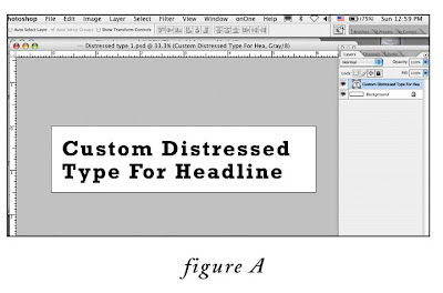
1. Create a new, blank, 300 ppi grayscale document in Photoshop that comfortably fits your headline. Choose a font that has some weight to it, since we will be degrading it. In this example I have created a document 6”wide x 1.5”high, and with the type tool, typed the words “Custom Distressed Type For Headline”in 35pt Rockwell Bold (fig. A).
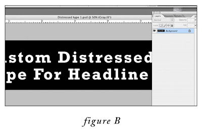
2. Flatten the file (layer menu>flatten image).
3. Invert the image (image menu>adjustments>invert) (fig. B)
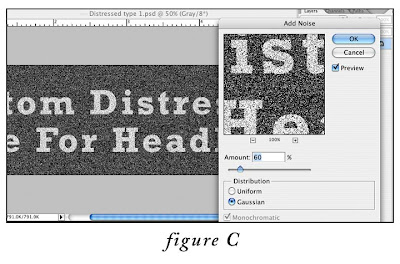
4. Apply the Noise filter: go to Filter menu > Noise > Add Noise…, set the amount to 60%, the distribution to Gaussian. (fig.C)
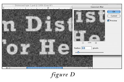
5. Next, apply the Gaussian Blur filter: go to Filter menu > Blur > Gaussian Blur…, set the radius to 2.0 pixels. (fig. D)
6. At this point, we need to upsample (increase the resolution by interpolation) the image to 1200 ppi. This is because we are eventually going to the convert the image to line art (just black and white, no levels of gray), and line art requires a higher resolution than grayscale to avoid the “jaggies”. So, go to Image menu > Image Size, MAKE SURE the “resample” and “constrain proportion” checkboxes at the bottom are BOTH checked, and in the document size box, change resolution from 300 to 1200 pixels/inch. (fig. E) Click okay.
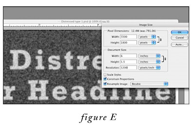
7. Next, we need to add a “Threshold” adjustment layer. Go to Layer menu > New Adjustment Layer > Threshold. In the first dialog box, labeled “New Layer” leave the default settings, click okay. In the second “Threshold”dialog box (fig.F), leave the slider set to the default “128”for now, click okay. As you can see, the threshold adjustment layer converts every pixel in the image to either black or white, depending on where the slider is set. We’ll come back to this in a minute to adjust this setting.
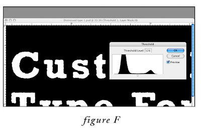
8. Almost done. Now, click on the Threshold adjustment layer you just created in the layers palette to make sure that it is the active layer. Then, add an “Invert” adjustment layer ON TOP of the “Threshold” adjustment layer, by going to Layer menu > New Adjustment Layer > Invert (in the dialog box labeled “New Layer”, leave the default settings, then click okay). This converts the type back to black on white. (fig. G)
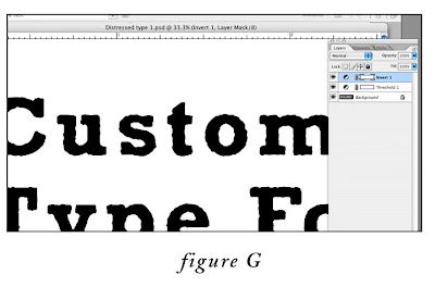
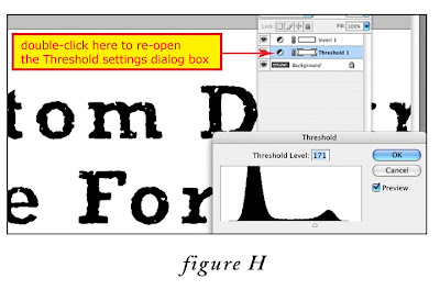
9. Here is the fun part. To customize the amount of “distress”, in the Layers Palette, double click on the Threshold Adjustment layer icon (circle divided diagonally in half) to call up the Threshold dialog box. Experiment with moving the slider gradually to the right to increase the level of distress (fig. H). That’s it! If you want to tweak things further, try experimenting with the Gaussian Blur and Noise settings in steps 4 and 5. Impress your friends, and have fun.
Subscribe to:
Posts (Atom)