Friday, April 11, 2008

Recent Work: Five Million Lives


This assignment was for Nursing Management Magazine’s feature on the Institute For Healthcare Improvement's Five Million Lives Campaign, an ambitious effort to save five million hospital patient lives over a two-year period through improved health-care practices. The illustration was to focus on the daunting scope of this challenge, rather than on any particular medical practices. Here are the sketches I submitted, and the finish. It is often a bit of a struggle for me to brighten my palette for these “upbeat” pieces, and this is something I am really trying to work on lately. I feel pretty good about this one. Art Director: Michael Trinsey.

Monday, March 17, 2008

Recent Work: “Smoke” Book Jacket Sketches

Smoke is a middle grade novel by Mavis Jukes. In the story, twelve-year-old Colton moves from rural Idaho to a farm in northern California with his mom and his twenty-pound Maine Coon cat, Smoke. His parents are divorced, as his mother tries to start a new life. His dad is a rodeo performer, whom Colton idolizes, but rarely sees. In the story, themes of separation and longing are eventually balanced by the strength of family ties, community and the growth in awareness that increasing maturity brings. In the sketches I tried to suggest a sense of place, while evoking themes of melancholy and mystery.

The first sketch shows the cat, Smoke (who figures prominently in the plot), overlooking the California countryside. Notice the little rodeo rider in the “O”.


The second sketch shows a silhouette of Colton on a weathered wood background. In the story, an old license plate with bullet holes and a bronco-buster is one of Colton’s prized possessions. This is my favorite.


The third sketch shows Colton and Smoke overlooking their farmhouse. Sort of picturesque and melancholic. Not sure exactly how I would pull off this artwork if gets picked.


Fourth sketch focuses on the Western theme (probably too much).


The art director for this project is Robbin Gourley at Farrar, Straus, Geroux.

Experimental Stuff: Hand-Drawn Style

For the past couple of months I have been playing around with a new hand-drawn style. I am always looking for new ways to depict figures, and my hope is this will give me more options, and a wider latitude in the types of projects I am able to take on. I like the idea of juxtaposing the hand-drawn images with the 3-D objects. Here are the first results:

Tuesday, March 4, 2008

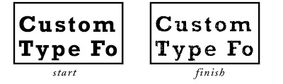
Tutorial: Creating Distressed Type In Photoshop


Here is a (fairly) simple way to create your own custom distressed type in Photoshop. This tutorial assumes an intermediate level of experience with Photoshop. This tutorial was created in version CS2 on a Mac.

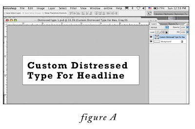
1. Create a new, blank, 300 ppi grayscale document in Photoshop that comfortably fits your headline. Choose a font that has some weight to it, since we will be degrading it. In this example I have created a document 6”wide x 1.5”high, and with the type tool, typed the words “Custom Distressed Type For Headline”in 35pt Rockwell Bold (fig. A).

2. Flatten the file (layer menu>flatten image).

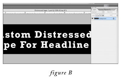
3. Invert the image (image menu>adjustments>invert) (fig. B)

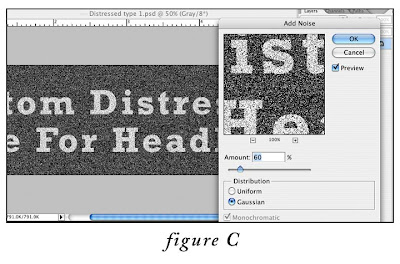
4. Apply the Noise filter: go to Filter menu > Noise > Add Noise…, set the amount to 60%, the distribution to Gaussian. (fig.C)

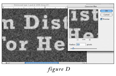
5. Next, apply the Gaussian Blur filter: go to Filter menu > Blur > Gaussian Blur…, set the radius to 2.0 pixels. (fig. D)

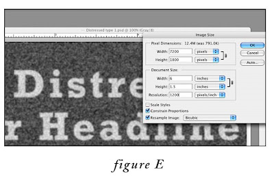
6. At this point, we need to upsample (increase the resolution by interpolation) the image to 1200 ppi. This is because we are eventually going to the convert the image to line art (just black and white, no levels of gray), and line art requires a higher resolution than grayscale to avoid the “jaggies”. So, go to Image menu > Image Size, MAKE SURE the “resample” and “constrain proportion” checkboxes at the bottom are BOTH checked, and in the document size box, change resolution from 300 to 1200 pixels/inch. (fig. E) Click okay.

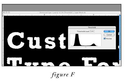
7. Next, we need to add a “Threshold” adjustment layer. Go to Layer menu > New Adjustment Layer > Threshold. In the first dialog box, labeled “New Layer” leave the default settings, click okay. In the second “Threshold”dialog box (fig.F), leave the slider set to the default “128”for now, click okay. As you can see, the threshold adjustment layer converts every pixel in the image to either black or white, depending on where the slider is set. We’ll come back to this in a minute to adjust this setting.

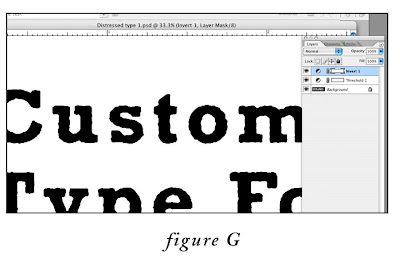
8. Almost done. Now, click on the Threshold adjustment layer you just created in the layers palette to make sure that it is the active layer. Then, add an “Invert” adjustment layer ON TOP of the “Threshold” adjustment layer, by going to Layer menu > New Adjustment Layer > Invert (in the dialog box labeled “New Layer”, leave the default settings, then click okay). This converts the type back to black on white. (fig. G)

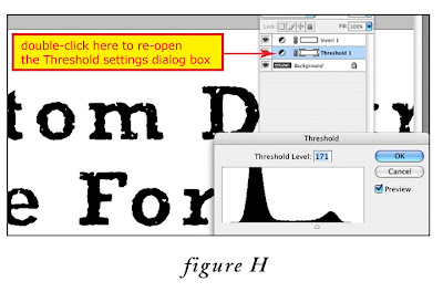
9. Here is the fun part. To customize the amount of “distress”, in the Layers Palette, double click on the Threshold Adjustment layer icon (circle divided diagonally in half) to call up the Threshold dialog box. Experiment with moving the slider gradually to the right to increase the level of distress (fig. H). That’s it! If you want to tweak things further, try experimenting with the Gaussian Blur and Noise settings in steps 4 and 5. Impress your friends, and have fun.
Wednesday, February 20, 2008

Recent Work: Auditor Portraits


Every other month I do a spot portrait of a featured expert profiled in Internal Auditor Magazine. I am given a few photographs to choose from and a manuscript of the interview. I understand little of the technical information, but I try to pick out a couple of elements to include in the illustration, whether it is a part of the globe, an acronym, or a type of currency. Here are a few samples from the past year or so.

Client: Yacinski Design
Art Director: Carol Hardy

Thursday, February 7, 2008

Recent Work: Military Timeline


This was a recent piece for creative director, Lynne Woychik, at Military Officer Magazine. The article discussed the media’s attitude towards the military throughout the history of the U.S. Lynne wanted a creative approach to the standard historical timeline. It’s always a bit more of a challenge for me when the client supplies all of the photographs, so I tried to have fun with the background, mimicking a sort of “Rauschenbergian” approach. Everything was pretty much built and painted traditionally, except for the photos and a few minor elements, which were added digitally.

Tuesday, February 5, 2008

Recent Work: Dead Flower Print


This is a recent print I have been working on.

My wife and I love flowers. We are not gardeners, but we like them enough to buy fresh ones every week. I am always inspired by them, and I’ll say to myself, “boy, I’ve really got to draw those flowers,” or “I have to photograph those flowers.” But for some reason, I never get around to it until they are dying or dead. At first I thought this was just procrastination, but now I think I just like them in a state of decay. I felt better about this somewhat morbid preference after recently hearing this quote by the British novelist, Jim Crace, being interviewed on The Diane Rehm Show:

“[Many people today think of nature as consisting of] rainbows and nightingales and daffodils, things that look good and smell good. Actually, a greater truth about the natural world is that it is made up of compost, and until we start to recognize that the earth is made up of creatures and death and putrefaction and glorify that as well, we are going to lose touch with the world.”